Baywood Interior Millwork, the primary supplier of store fixtures for M&M Food Market shares a recent article from Strategy Magazine
Baywood Interior Millwork, the primary supplier of store fixtures for M&M Food Market shares a recent article from
Strategy Magazine
By Josh Kolm
October 19, 2016
Inside the new M&M Food Market
The frozen food retailer revamped its store layout in an effort to make meal planning easier and more aspirational
You may have noticed some changes at your local, recently-rebranded M&M Food Market.
Last year, Shikatani Lacroix created two different concepts for the retailer, which it tested with consumers:
“Kitchen” was more focused on the aspirational aspects of food and meal planning, while “Timely” attempted
to meet the needs of time-starved consumers looking for fast meal solutions.
The result is based heavily on the “Kitchen” concept, with certain elements from “Timely” included.
It was launched late last year and has since been rolling out to M&M’s 425 locations across Canada.
When M&M first launched, it was a unique proposition that a lot of Canadians had a deep connection with,
says Richard Dirstein VP of design and innovation at Shikatani Lacroix.
It created this niche where frozen food was aspirational and could be great products,
but the challenge was that model hasn’t changed.
You would go in, look at hundreds of white boxes that you’d have to ask the salesperson to get for you.
There’s a great opportunity to tell product stories and explain why this is a great piece of chicken
or great-tasting cheese cake and the great meal that could be created out of it.
We just needed a platform and package to do that through.
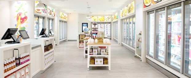
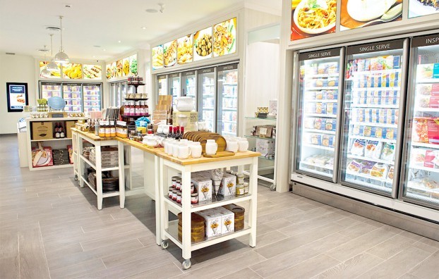
The new store is meant to encourage more self-shopping and help consumers learn about the products and what might go well with them.
The cash-out counter is less of a barrier to the products, transformed into the main place for sampling.
Customers no longer have to wait in line at the counter to be served.
Because sales staff are not guiding customers to specific products, the store layout had to be redesigned for easier navigation.
The new packaging created by Shikatani is colour-blocked, making it easier to identify different product categories
like proteins, vegetables, desserts or appetizers, and the store is organized in much the same way.
It also features back-lit product cases and utilizes the 400-plus product shots it took as part of the package redesign
throughout the store to show the food in context as part of an entire meal.
Keeping with the idea of providing solutions for the whole meal, the stores also feature a curated collection of plates and
serving dishes ideal for M&M products.
Digital screens throughout the store display product information and recommendations, which also appear on the redesigned M&M website.
Many locations also now offer click-and-collect online ordering.
“There’s a lot of equity with the brand,” Dirstein says about M&M, which launched in 1980.
We explored a range of new logo options, but there was a lot of recognition around that orange and blue.
People were just looking for it to be redefined a little. Repositioning it from being a ‘meat shop’ to the whole meal doesn’t
alienate existing customers but still signals to rest of population that there is something unique for them here.
There is an increasing amount of pressure on frozen CPG products as consumers look for healthier and fresher food options.
Dirstein says the new M&M store will help differentiate its brand and help it compete by becoming a true one-stop shop
that helps customers create full, impressive meals from its frozen products quickly and easily.


